Saturday, January 15, 2005
AESTHETICS
I look at uniforms a lot, and notice weird little details. Did you notice when the Mariners changed their uniforms in 1993 that the piping wasn't going down the sides of the pant legs anymore? That's the kind of weird crap I notice.
But today, I notice this...
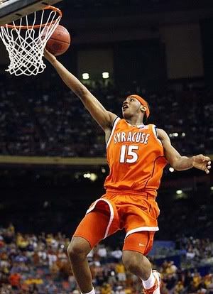
Take Syracuse's uniforms last year (technically this one's from two years ago, since it's Carmelo)...
...and compare them to the uniforms of this year.
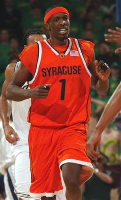
What the frick was wrong with last year's uniforms? They were at least tasteful, the numbers stood out pretty well, and that bodes well on television.
This year, that black or navy blue just goes horrible over that orange, and worse yet, it looks brutal on television during game action. White on orange stands out a lot better than black/navy on orange. Worst of all, it's bland and the font is dorky. If they just added some white outlining to the lettering on the uniforms, it'd add a lot more and I'd bitch about it less.
The last time I was this stirred by a dumbing-down of a uniform, it was when the Padres took all of the color and pinstripes out of their home tops when they were still playing at the Murph.
In related news, I have no life.
[Edit ~8:47p -- Get this; Nike did TWO YEARS' worth of research to come up with the new uniform and lettering scheme that I've bitched about in this entire post.]
But today, I notice this...
Take Syracuse's uniforms last year (technically this one's from two years ago, since it's Carmelo)...
...and compare them to the uniforms of this year.
What the frick was wrong with last year's uniforms? They were at least tasteful, the numbers stood out pretty well, and that bodes well on television.
This year, that black or navy blue just goes horrible over that orange, and worse yet, it looks brutal on television during game action. White on orange stands out a lot better than black/navy on orange. Worst of all, it's bland and the font is dorky. If they just added some white outlining to the lettering on the uniforms, it'd add a lot more and I'd bitch about it less.
The last time I was this stirred by a dumbing-down of a uniform, it was when the Padres took all of the color and pinstripes out of their home tops when they were still playing at the Murph.
In related news, I have no life.
[Edit ~8:47p -- Get this; Nike did TWO YEARS' worth of research to come up with the new uniform and lettering scheme that I've bitched about in this entire post.]
/ Click for main page
![]()